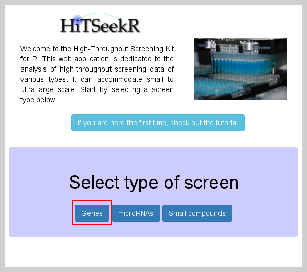
Genes and their products are the basic unit of the cellular machinery. Systematically inhibiting gene function is thus an ideal tool for functional and drug studies based on cellular responses. This type of screen is supported in HiTSeekR and begins by selecting the appropriate screen type:
After selecting genes on the initial page, the input data tab is shown:
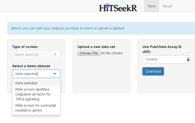
Here, the user is offered three choices:
Selecting one of the available demo datasets for this screen type
Uploading a new dataset in a comma, semicolon or tab separated format
Selecting and downloading a dataset from PubChem via its assay id (AID)
For now, we will select RNAi screen identifies Caspase4 as factor for TNFa signaling as input (obtained from http://mcb.asm.org/content/32/17/3372.abstract). This action will change the view:
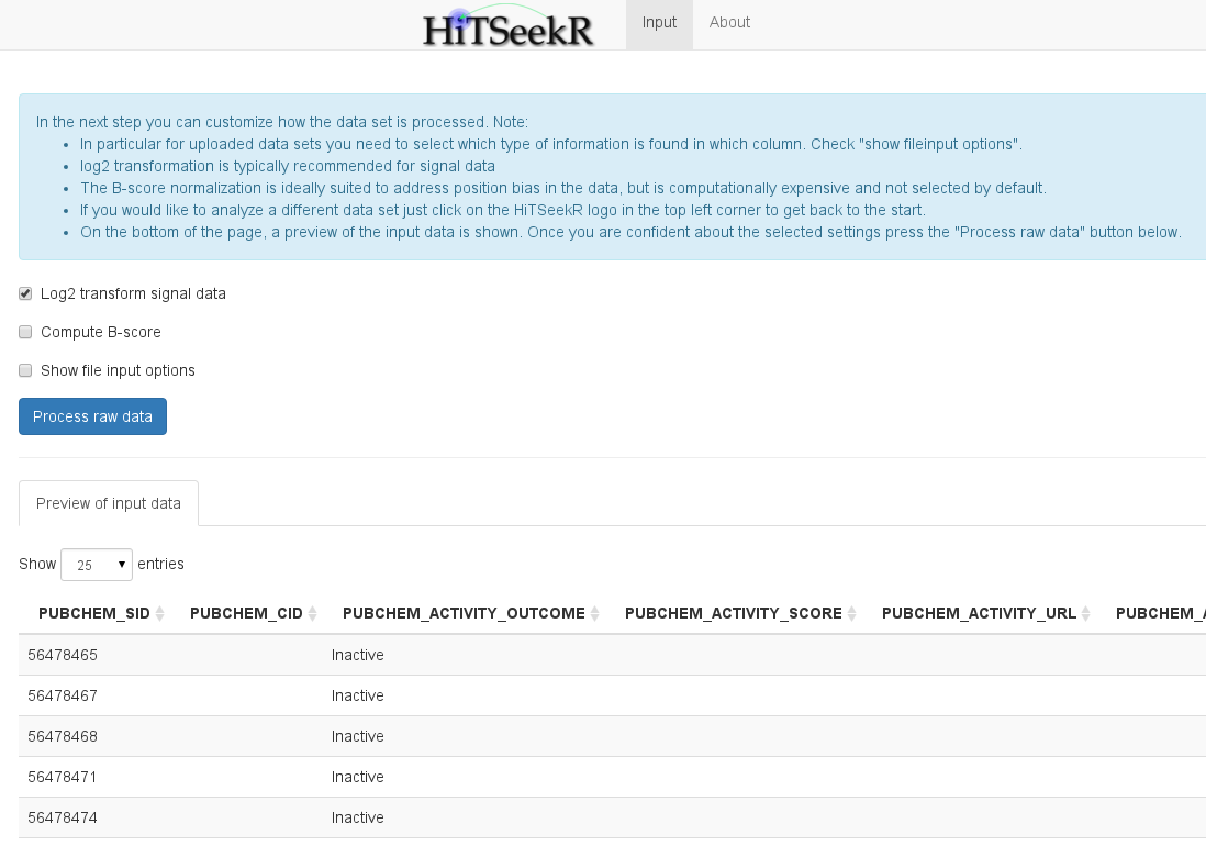
At the bottom of the page, a table is shown that represents a raw representation of the input data. This allows the user to check if the data was read in correctly and to identify the content of each column. The user now has to decide whether the measured values need to be log2 transformed (stabilizes variance between lower and higher signal values), if the B-score should be calculated (This is a computationally expensive score suitable to counter position related effects), and, most importantly, the user can also assign columns of the input data to properties in HiTSeekR. This step can be omitted for demo data since the column assignment is pre-configured. For custom uploaded and PubChem downloaded screens, however, this step is necessary before the analysis can be continued:
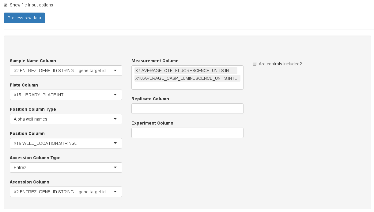
Please take your time to do the column assignment right, because experience shows that most of the problems with using HiTSeekR are caused by incorrect column assignments. A few notes:
| Sample | Experiment1 | Experiment2 | Experiment3 | Accession |
|---|---|---|---|---|
| … | … | … | … | … |
In contrast, this header is normalized:
| Sample | Experiment | Accession |
|---|---|---|
| … | Experiment1 | … |
| … | … | … |
| … | Experiment2 | … |
| … | … | … |
| … | Experiment3 | … |
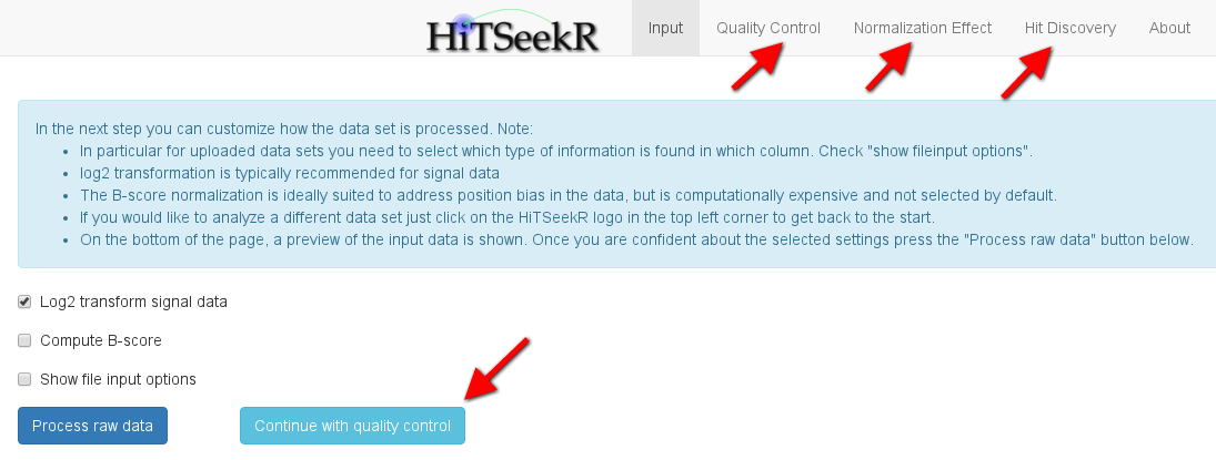
If multiple columns of experiments, readouts, or measurements are selected, HiTSeekR will attempt to construct a normalized table. Note that this multiple column feature is currently restricted to one of those three types. After choosing the appropriate columns the user is encouraged to click on Process raw data to continue. After successful processing, new options will appear in the tab bar on top of the page. In addition, continue buttons like the one highlighted here are supposed to guide the user through the process:
In the next step of the analysis, various plots are produced to illuminate various aspects of the screening quality. The following plot, for instance, gives an impression of the signal distribution over the entire screen. Each box plots here depicts the signal spread of one plate, allowing it to easily spot differences of plate means and signal variance. Please note the checkbox show help text, which, when clicked, will provide additional information on each plot to help the user with the interpretation:

The following plots are available:
The main purpose of the quality control step is to learn about bias in the raw screening data. This allows the user to make informed decisions on the choice of normalization method in the next step.
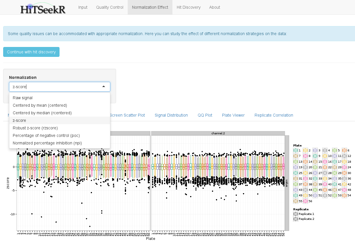
In this step, various normalization methods can be compared by investigating their effect on the data. First, the user can select one of the following methods:
The plots will then be updated to reflect the chose normalization. As an example, we here show the plate signal variation plot again, which, with the selected z-score, guarantees that the plate means are now aligned:
In addition, to a downloadable table with all of the normalized values, the following plots are available to study the effect of a normalization method:
When the user feels confident with the different normalization methods and their effect, we continue with the identification of active samples, also called hits.
In this step, the user is required to select a normalization and hit identification strategy to identify those samples that are considered active, i.e. that change the phenotype in the experiment.
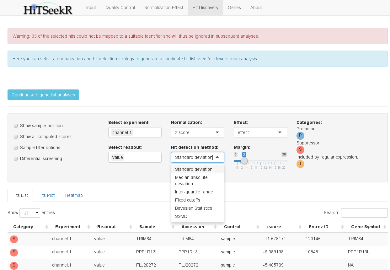
Here, users might feel a bit overwhelmed with the different options at first, so let’s go through them one by one, starting with the select boxes.
A number of check boxes on the left side provide additional options:
Below the options panel, a tabular hit list is shown. This table, like all tables in HiTSeekR, can be downloaded (button below the table), sorted after arbitrary columns and searched either on the entire table or on a specific column.
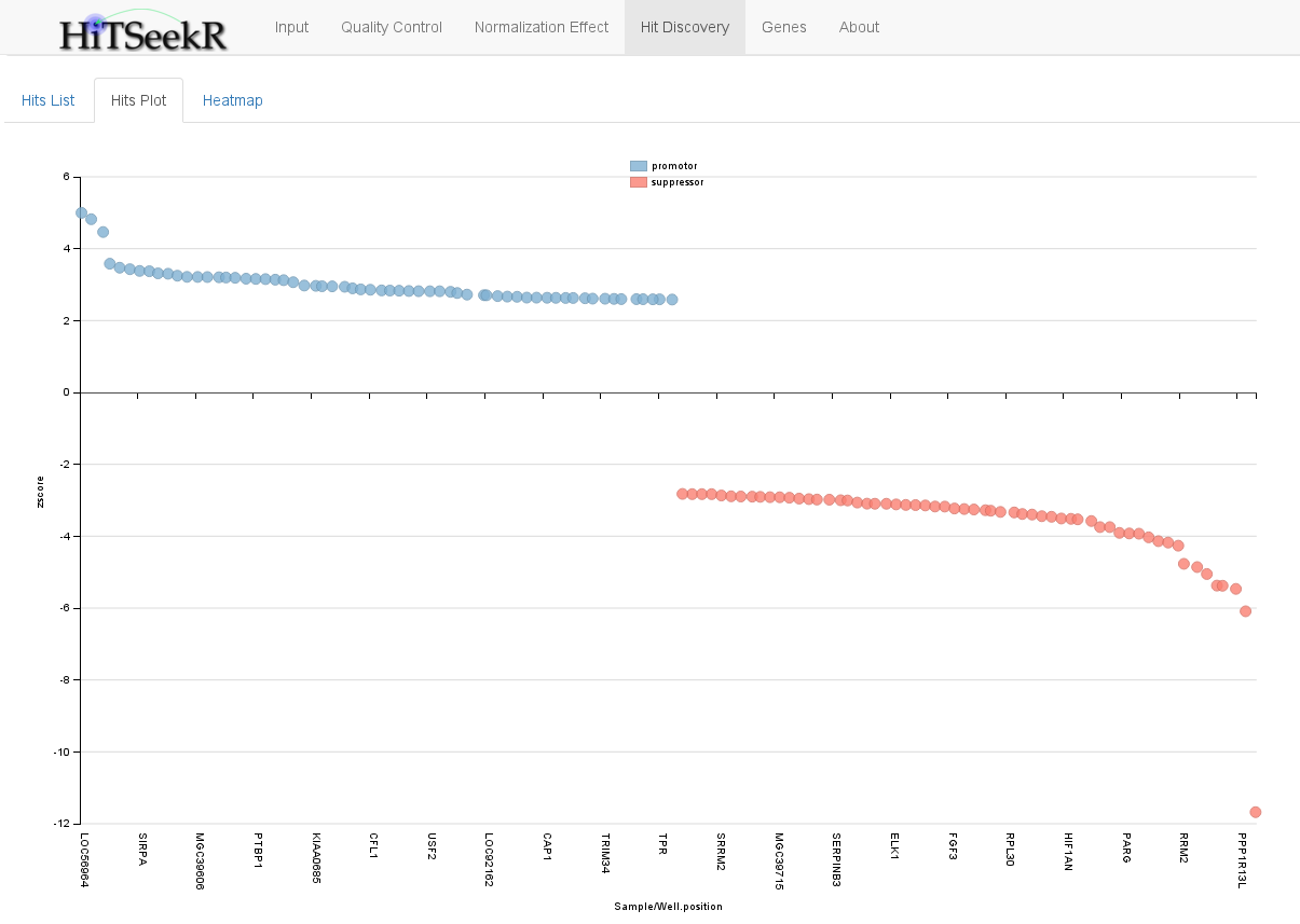
The hits plot tab provides a graphical representation of the screening hits in a scatter plot:
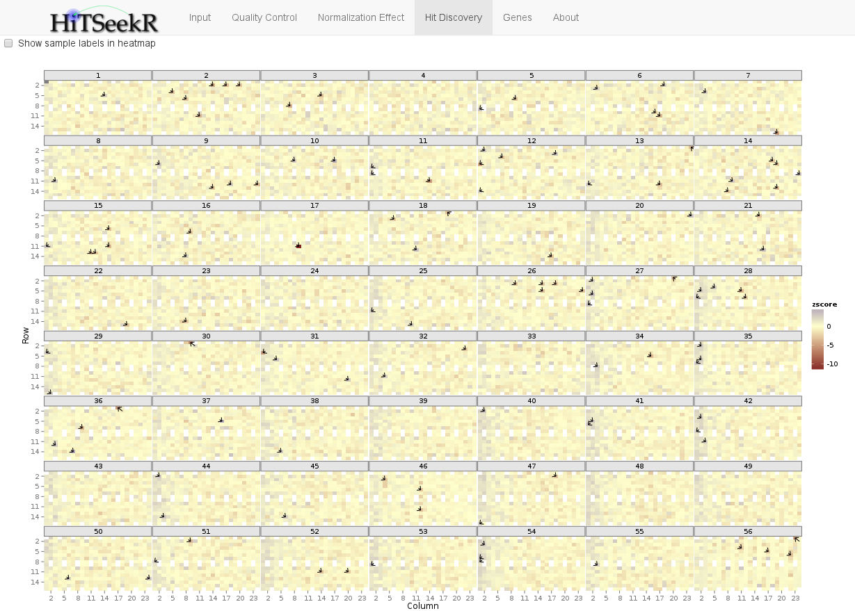
Finally, the Heatmap is a graphical representation of the entire screen. Hits are depicted by small black arrows. This plot allows the user to quickly spot if hits accumulate on a specific plate or a general plate location (e.g. mostly in the first row or column etc.), which might indicate problems with the selected normalization or hit identification strategy:
When the user has successfully selected hits we are ready for downstream analysis. Therefore, additional tabs are unlocked as soon as the hit discovery tab is selected.
The hit list in a gene silencing experiment such as RNA interference or CRISPR / CAS9 screens consists of a number of genes that are associated with a studied phenotype. While each of these hits might be an interesting gene for follow-up experiments, limited resources usually do not permit to do this. Moreover, effects observed with individual genes might in some cases be attributed to off-target effects etc. It is therefore of interest to consider the observed changes in phenotype on the level of systems biology. This provides functional annotation of, for instance, pathways and biological processes involved in these changes. In addition, it allows for new complex hypotheses to be developed and to be tested in future experiments. In HiTSeekR we distinguish two general types of systems biology analysis:
Gene sets are manually curated collections of genes that are annotated with biological properties. This includes gene ontology terms and pathway sources such as Reactome or KEGG. Two methods are integrated in HiTSeekR to test if a given hit list is significantly associated with given gene sets, namely gene set overrepresentation analysis, which relies on hypergeometric testing, and gene set enrichment analysis, which is based on the computation of a running sum statistic and evaluates significance via generating permutations of the ranked genes. The minimum gene set size that can be adjusted here will help to reduce the number of tests by ignoring smaller gene sets.
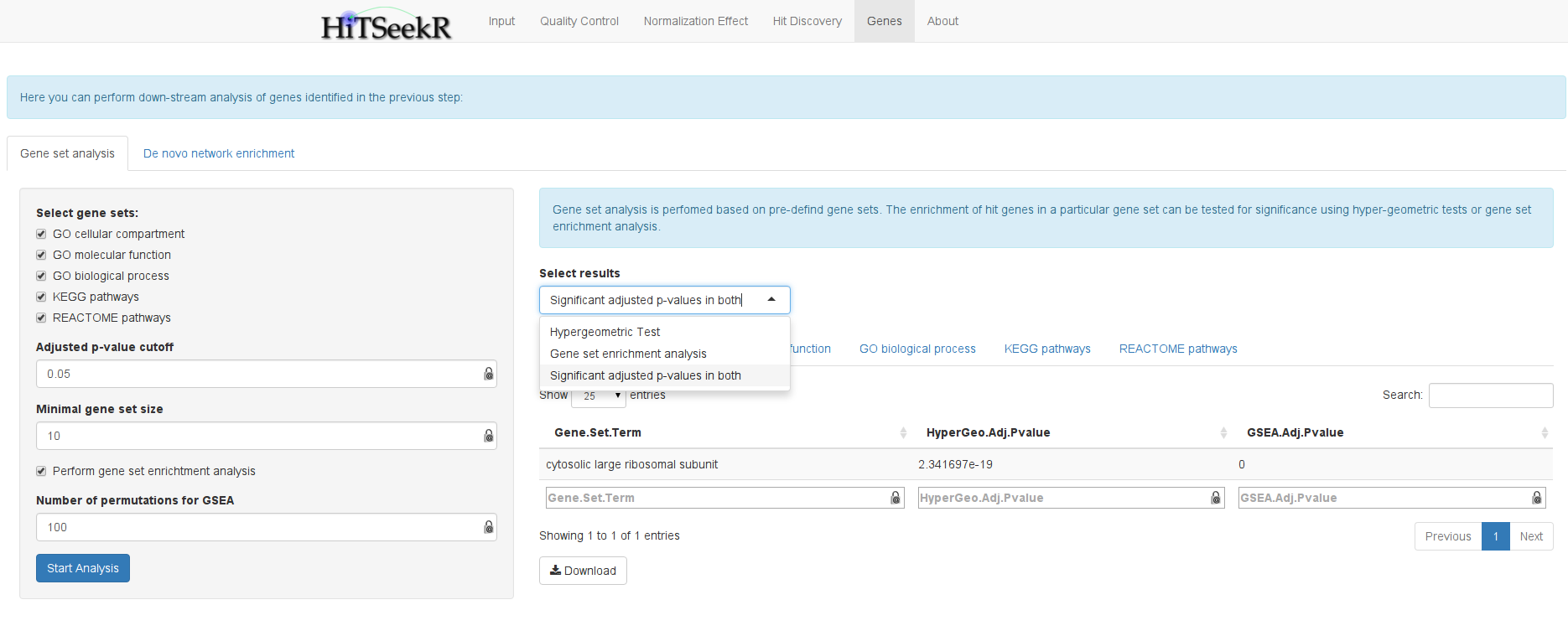
Because a complete list of tested samples together with their achieved scores are required for gene set enrichment analysis, this is only supported for gene silencing experiments, where information on all genes is available. Moreover, due to the computational demands of this method, the number of permutations in the server is currently limited to 100. The user can select the results of the computed gene sets. Moreover, the results are divided into:
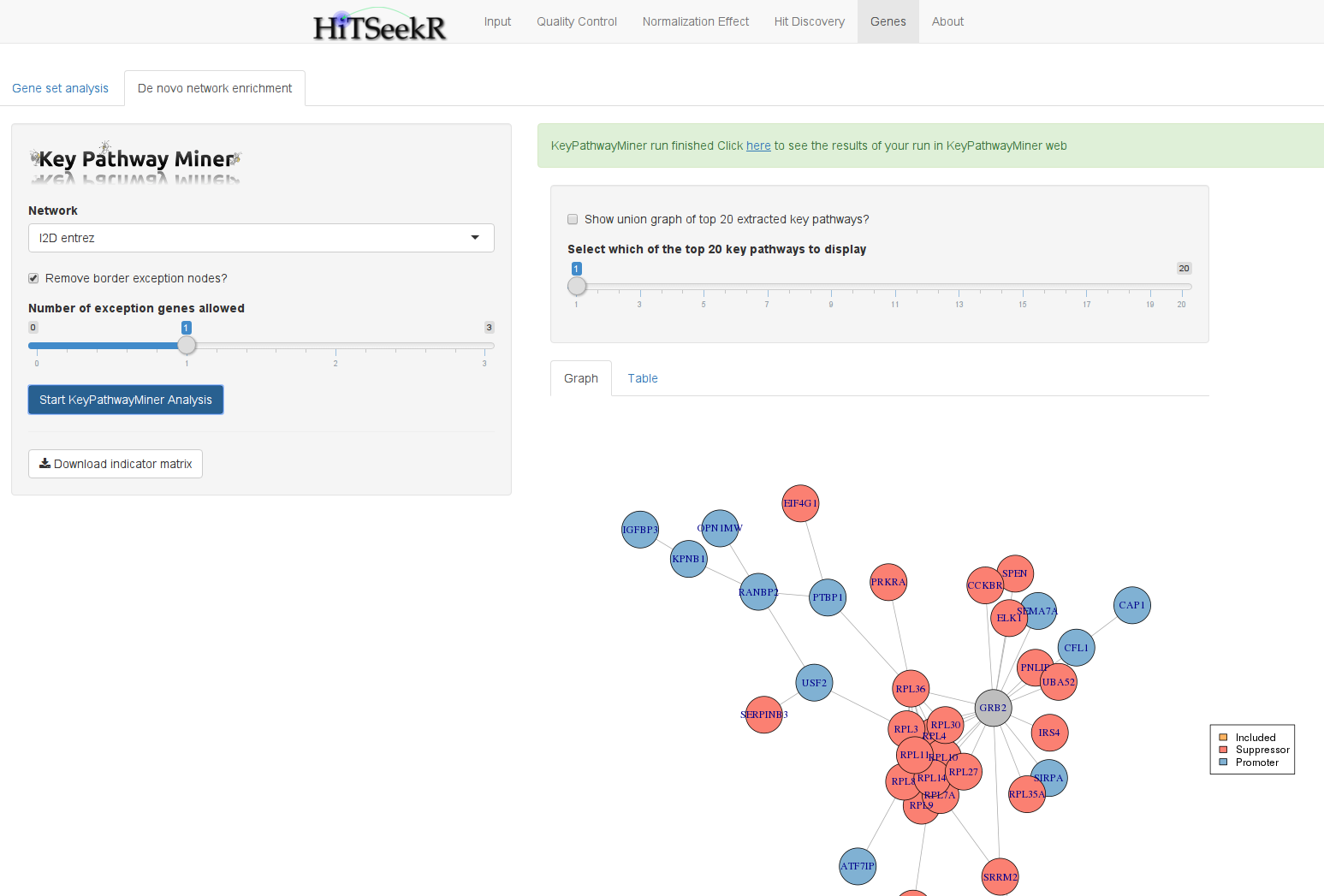
In contrast to gene set analysis, which depends on the quality of existing functional annotations, de novo network enrichment operates directly on large interaction networks that are not subject to this bias. The idea is to extract as large as possible sub-networks that are enriched with active genes. These can be the hits of a gene silencing screen or the miRNA or drug target genes, respectively, for the other two types of screens. KeyPathwayMiner is a tool that enables efficient extraction of such subnetworks from arbitrary networks. In HiTSeekR, the web version of KeyPathwayMiner was integrated via its webservice API. This has the advantage that computations are outsourced and that the user can continue working with HiTSeekR until the results are reported back.
To get started with a KeyPathwayMiner analysis you should first select a network and the number of exception genes you want to allow (between 0 and 3). This corresponds to the number of non-hit genes that KeyPathwayMiner is allowed to add to connect smaller sub-networks into larger ones. This parameter thus enables the user to take direct influence on the network enrichment process through an intuitive parameter.
When computation is complete, KeyPathwayMiner will show a slider that allows you to go through the top 20 subnetworks found. You can also select to draw a union graph composed of all 20 solutions in which reoccuring genes are colored in a gradient from grey (appeared once) to bright green (was part in several or all solutions). All solutions can be exported in a cytoscape compatible SIF format and as a tab delimited table.
Note that pressing the “Start KeyPathwayMiner Analysis” button again will trigger a new analysis and erase existing results without a warning.
